Autopay auto OTP (One time Password) for online payments
TEAM
Solo Project
TOOLS USED
Miro and Adobe XD
TIMELINE
4 Days
WHAT I DID
I carried out user interviews and did secondary research on the existing features. Ideated various features to be incorporated and worked on the visual screens and prototypes.

TLDR / OVERVIEW
Autopay helps streamline the payment process for users by eliminating the need for manual entry of One-time Passwords (OTPs). This innovative feature ensures that users no longer have to worry about forgetting their OTPs, which are often sent via text message, or navigating away from the payment verification page to retrieve them. In addition to providing a seamless and convenient user experience, Autopay also keeps track of the time remaining to complete a transaction, as OTPs have a limited time frame before expiration. Autopay is a comprehensive and efficient application that automates entering OTPs, making online payments a breeze for users.
BACKGROUND
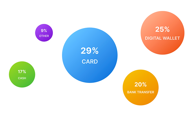
The popularity of card payments

Source: J.P. Morgan 2019 Payments Trends – Global Insights Report, 2018.
Popularity of card Payments
Lets look at some of the statistics below:
-
Consumers increasingly use mobile devices for online transactions, and merchants seek solutions to provide seamless experiences. As digital banking improves, customers want quick and secure payment options. Card payments, UPIs, and digital wallets are becoming popular for e-commerce, food delivery, and grocery apps. Card payments are gaining global acceptance.
-
In India, mobile commerce has become the primary payment method for online shopping, with a 46% adoption rate. With the shift to smartphone-driven online shopping, digital payments like cards and digital wallets are growing in popularity, replacing the previous dominance of cash payments in the e-commerce market.
-
A recent report by JP Morgan states that cards are the most widely used payment method for online shopping in India, accounting for 29% of transactions worth $10.6 billion in sales. With the predicted compound annual growth rate of 53% by 2021, cards can potentially increase their market share in India. By conducting a case study on existing solutions, analyzing competitors, and incorporating a user-centered design, the implementation of card payments can be optimized for maximum success in the Indian market.
Existing flow of card payments online

The user stores the card as a payment mode with the credentials such as expiry date, name, and CVV. This CVV needs to be provided every time the card is selected.

Users are directed to a particular bank’s page and a prompt to enter the OTP, and a message containing the OTP will be sent to the registered phone number.

The user manually enters the OTP and clicks on submit, and if the authentication is successful, the transaction is complete.
PROCESS
Design Process

RESEARCH
Analysis
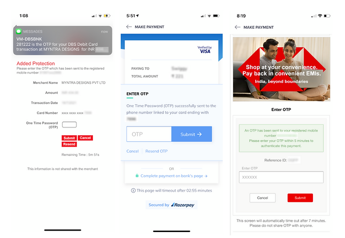
I tried analyzing various applications like Myntra, H&M, Zara and tried to check if these e-commerce platforms have enabled autopay. I have attached a few screenshots for reference and what problems I saw through these gateways. Here are a few screenshots.

-
In the first instance, it redirected to the bank’s secure payment after entering the CVV. There was no option where the OTP auto-entered, making it difficult to remember the OTP.
-
In the second figure, the application uses Razorpay’s secure page; no feature to inform the user of the time left before the OTP expires, and no auto OTP.
-
The third instance was on the bank’s payment page, where it was difficult to keep track of the time left and hard to remember the OTP, the auto feature was lacking here too.
RESEARCH
Insights from user interviews


RESEARCH
Scoping down the problems
Delays in receiving OTP
Multiple page redirects
Forgetting the OTP after moving out of the application
Short time duration to enter the OTP


WIREFRAME
Putting my ideas on paper
To get a clear understanding of how the end result should be. I sketched out the basic idea out here and moved on to the visual designs.

DESIGN
Visual Design of the Screens
After completing the wireframes, I designed the screens to keep usability in mind. Since the users are diverse when it comes to payment. I wanted to blend my designs with pre-existing designs with some minor changes for better feasibility.
Here is a brief overview of the key aspects, which I will further elaborate on below each screen:
-
I have introduced a progress bar that gives the user a better understanding of the step they are currently on.
-
A timer shows the time left and text.
-
A progress bar on the auto OTP submit button where the user can cancel in case he/she does not want to proceed with the transaction.

Choosing the preferred card
-
The user can choose the preferred payment modes on the first screen, such as cards, wallets, cash, and vouchers.
-
The user can select a card from the list of saved cards.
-
Once the card is selected, the user enters the CVV present behind the card and moves to the next step.
Auto OTP generation
-
A progress bar that gives the user a better understanding of the step the user is in.
-
The first step is the OTP reading phase, when one needs to wait for the OTP from the bank. I have included a timer with a progress bar to show how much time is left.
-
In the second step, where the Auto OTP is keyed in, the user can see which phase the user is in, and after a few seconds, the OTP is auto-entered. If the user wants to cancel the transaction, he can tap the button.
-
Users can see the payment details and the card they used for the transaction on these pages.

Lets take a look at the prototype

Successful transaction
-
Once the transaction is successful, the user gets feedback that the payment is successful.
-
The progress bar shows that all three stages have been completed.
REFLECTION
Things I learned.
Keeping up with fast-paced design tasks
The task at hand allowed me to strengthen my skills in resourceful problem-solving, utilizing secondary research to gather information and generate creative solutions quickly. Through careful planning and efficient execution, I successfully brought my ideas from concept to prototype in four days.
Leverage from existing solutions that exist
As I delved into research for this task, I meticulously examined the existing solutions offered by competitors and identified their limitations. I then applied this knowledge to create a solution that effectively utilizes limited resources while also ensuring user comfort and ease of use when it comes to payment gateways.
Keep the design simple and clear
In my design approach, I prioritized simplicity and effectiveness. The key objective was to ensure the user is well-informed and guided throughout the entire process, while also keeping the design clean and easy to navigate. By adhering to the principle of "keep it simple," I was able to create a user-friendly and efficient solution.